RT Lately is a time-traveling witness to the evolution of gothics and attests to over a century of technological and stylistic transitions. By building on the past, it accentuates instances throughout the timeline and shifts its legacy back to the zeitgeist.

ORIGIN
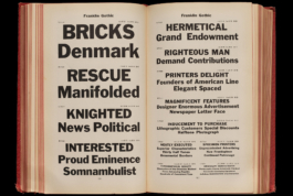
Times Gothic
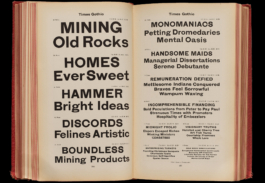
Times Gothic in “American Line Type Book: Borders and Ornaments Price List, Printing Machinery and Material”, American Type Founders Company, 1906, images provided by “The Letterform Archive”
Sometime in 2021 I was digitally flipping through an American Type Founders specimen when a typeface called Times Gothic caught my attention. It is based on Grotesque No. 4, originally cast by the Scottish type foundry “Miller & Richard” from Edinburgh.
Some minor differences aside, the two typefaces seem to be the exact same design. The wonkiness and raw nature of this sans somehow sparked my interest. It was presented on just a handful of pages with the stereotypical sample text in various sizes.

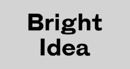
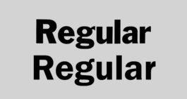
Times Gothic with generally wide proportions visible here the letters e, o but also n
Times Gothic’s probably most striking characteristic are its overall wide proportions and almost geometric construction rendering round glyphs very circular. The widths are further extended through the typeface’s narrow apertures and horizontal terminals both of which move stroke endings outwards. Other key glyphs like the n often adapt accordingly and are designed rather wide as well.
Times Gothic’s overall low contrast with higher contrast applied to middle strokes and crossbars for example in a, e and g
Times Gothic’s low contrast is generally better modulated in straight shapes than round ones. In letters with a higher stroke density due to multiple horizontals, higher contrast is applied to middle strokes and cross bars to keep outer strokes more monolinear.
Comparison of Times Gothic’s uppercase and lowercase key glyphs
Clogging shapes in Times Gothic’s letters A, G and N where strokes meet
Irregularities of stem thickness can be seen in the O, whose horizontal stroke is too thick to match its vertical stroke. Contrary to this geometric construction the strokes of the o are well balanced. The lowercase is generally more refined compared to the sometimes crude uppercase shapes, which often struggle with contrast and weight distribution.
At the same time Times Gothic’s rough aesthetic comes in large parts from the lack of visual corrections to compensate certain effects. One example would be the dark spots generated by two or more strokes meeting which leads to larger, darker spots, see A, N or G.
Franklin Gothic
Franklin Gothic in “American Line Type Book: Borders and Ornaments Price List, Printing Machinery and Material”, American Type Founders Company, 1906, images provided by “The Letterform Archive”
While strong in personality Times Gothic is naive in approach and raw in execution. It lacks the sensitivity of a widely applicable sans and was only in parts useful as a reference. For instances where it failed to deliver, another offered some guidance.
Just a few pages back within the same specimen, Franklin Gothic can be found. It was originally designed by Morris Fuller Benton and released in 1902 as a single style. Compared to Times Gothic it is in many ways a more nuanced and sophisticated design. Despite being over 120 years old it still looks very contemporary and is known for its outstanding performance in display settings.

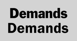
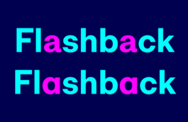
Franklin Gothic’s characteristic join treatment in a, n and d
One of Franklin Gothic’s most notable features is its treatment of joins. Bowls, shoulders and arms of shapes like b, d, h, m, n, p, q, r, and u simply intersect the stems without any transition.

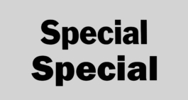
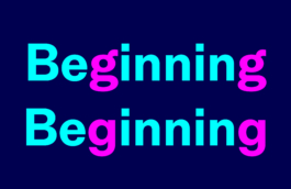
The strokes of letters with diagonals like A, M, and N in Franklin Gothic alternate in thickness
The oval counters of o, c and e
The second prominent feature is the typeface’s contrast. Vertical strokes are visibly thicker than horizontal strokes as can be seen in E, L and P. The strokes of letters with diagonals like A, M and N alternate in thickness creating a rhythmic pattern. Contrary to the monolinearity of Times Gothic this set-up helps to avoid the clogging up of shapes. In round shapes like e, o and c the contrast creates a nicely calibrated tension between oval counter and a more circular outline.
Both the joins and the contrast have an overall lightening effect and allow the proportions to stay narrow despite the bold weight. The interplay of these formal qualities lets the typeface excel in tight type setting while never appearing too crowded.
ITC Franklin Gothic

“Photoautomat” wordmark photographed on the way to my studio, Kanzleiareal Zürich
When I first developed an interest in typefaces as part of my design education, I would often try to identify the fonts I saw on the streets of Zurich. It was during that time I noticed the old photobooths. They had this backlit, white panel with bright red letters spelling “Photoautomat”. The analog application and the display quality of the shapes were striking. These glowing signs spread throughout the city were my first conscious encounter with Franklin Gothic, or so I thought.

Screenshot of the digitized ITC Franklin Gothic Demi
The “Photoautomat” wordmark is in fact set in ITC Franklin Gothic Demi which was released in 1980 along with the weights Book, Medium and Heavy. At the time the “International Typeface Corporation” (ITC) commissioned Victor Caruso to develop an extension of the original Franklin Gothic for photo typesetting.
Whenever typefaces made these transitions into new technologies they were altered in the process. A certain degree of change is inevitable but in this case some of the key features were redesigned with quite an effect. While ITC’s version is branded as a new Franklin Gothic it departs in many ways from the original.

Franklin Gothic’s lower x-height (left) compared to ITC Franklin Gothic’s higher x-height (right)
Raising the x-height was a common practice ITC used in their adaptations for photo typesetting. Nevertheless it’s a significant intervention since a higher x-height affects a wide variety of glyphs. It was by far not unique to this ITC redesign but here it contributed to a wider range of changes all pointing in one direction.
Franklin Gothic’s intersecting joins (top) compared to ITC Franklin Gothic’s smoother transitions (bottom)
Franklin Gothic’s personality defining joins were the subject of further impactful changes. Morris Fuller Benton’s original attaches strokes to stems without any curves applied. Caruso’s redesign fully smoothes these stroke connections in letters like m and n to a fluent transition from stem to shoulder and to a lesser degree in letters with bowls such as the d.
Franklin Gothic’s clearly angled terminals (top) compared to ITC Franklin Gothic’s terminals approaching the horizontal (bottom)
Franklin Gothic on top with a narrower a and wider r compared to ITC Franklin Gothic on the bottom with a wider a and a narrower r
ITC Franklin Gothic’s angles in terminals have been reduced to closely approach the horizontal. See a, c and e for reference. Even Franklin Gothic’s distinguishing asymmetric c has been replaced with a version where top and bottom terminals closely mirror each other.
Alongside these broader interventions, glyph specific modifications were made as well. Key letters were changed in width and style altering the overall proportions. Notable examples include the narrower r and the wider a.
To conclude, nobody can say for sure what the motivation behind the aforementioned changes was. What’s undeniable though is that raising the x-height, smoothing the joins, flattening the angle of the terminals and adjusting of glyphs goes beyond an update for better performance in photo type setting and pushes the typeface significantly closer to its hugely popular Swiss counterpart Helvetica.
DESIGN
I’m generally not too interested in historically accurate revivals in my work. Still, I’m convinced that a good understanding and formal analysis of the typefaces that came before is an advantage for designing new ones. RT Lately is a loose interpretation of the described influences paired with my personal taste and intuitive design decisions. References like the specimens I described are useful to discover potential for future projects and merely form a starting point. From a certain stage I usually open up my process allowing the typeface to decide what works best for it.
Vertical Proportions

Times Gothic (in the back) compared to RT Lately (in the front)
Times Gothic’s d kicked off RT Lately’s design as it contains the foundation for many personality defining characteristics. Some of Times Gothic’s letters are crudely designed but the d shows a higher level of quality in various aspects. Its vertical metrics, the degree of geometry, the treatment of joins and the overall contrast of the glyph strongly influenced the development of RT Lately.
Vertical metrics
RT Lately’s vertical metrics nicely interact with the geometry of the design while the modest x-height leaves enough room for the ascenders to extend giving the typeface a graceful presence.
Horizontal Proportions
Round letters leaning towards geometric proportions
RT Lately’s proportions are designed generously wide by carefully reinterpreting brutal geometry into softer and warmer shapes. The challenge was to deliver a strong personality while at the same time guaranteeing the quality and functionality of each letter’s drawing.
Default a (top) and alternate a.ss01 (bottom)
Default g (top) and alternate g.ss02 (bottom)
Default a + g (top) and with alternates a.ss01 + g.ss02 (bottom)
If desired, RT Lately’s geometric appearance can be further emphasized by activating one or both alternates through the typeface’s open type features. The stylistic set ss01 activates the single storey a while stylistic set ss02 activates the single storey g. Especially the alternate a is rather associated with traditional geometric typefaces and when both alternates are activated they are able to change RT Lately’s style significantly.
Contrast
Comparison of the o’s outline and its counter
Although I didn’t directly borrow too much from Franklin Gothic’s shapes, I adopted the idea of how inner and outer shapes interact. The o’s outline in RT Lately’s Bold weight is closely geometric and almost as tall as it is wide while its counter is of oval shape and creates a vibrant tension against it. This way RT Lately maintains a geometric appearance but avoids a rigid constructed aesthetic.
Contrast visualized through a mathematically constructed circle with the thickness of the vertical stroke of the o
The relationship between outline and counter automatically creates a degree of contrast. Once the optimal level was found for each weight it was applied to every glyph. It ensures even color in text blocks and thus makes RT Lately a versatile tool for various tasks.
Uppercase and lowercase contrast
Uppercase letters usually feature slightly thicker stems than the lowercase to compensate for additional white space due to their larger dimensions. The delicate balance was often exagerated in early grotesques and lead to peculiar results.
As a nod to these naive approaches RT Lately’s uppercase is designed slightly heavier than perfect and with slightly less contrast compared to the lowercase. Imperfections like these, employed carefully, can be used to award typefaces a nuanced personality.
Joins
Join treatment of shoulders, arms and bowls
I continued the tension of inner and outer shapes beyond just the round letters. The joins of shoulders in n, m and h are smoother and rounder on the inside but grow out of the stem in a seemingly straighter manner on the outside.
Same goes for the joins of bowls which are carefully tapered to optically retain the bowls’ effortless roundness, avoid clogging in small sizes and lend the typeface its clean and crisp look.
A special case is the r which features a more abrupt transition. In small sizes the arm almost seems to intersect the stem unmitigated. In larger sizes the true drawing with its smoother transition becomes visible.
Terminals & Apertures
Horizontally cut terminals and narrow apertures

Apertures of G and a
Apertures of S and e
RT Lately’s terminals are horizontally cut. The typeface manages to keep its apertures narrow enough to preserve a geometric vibe throughout the family while ensuring optimal balance in colour inside and out.
Italics
Italics
RT Lately’s italic features a modest 10° angle. The glyphs were continuously proofed, adjusted and received the same care as their upright counterpart. Their drawing is sharp and precise to optically match the upright style and seamlessly integrate in text.
Dots, Accents & Punctuation

Square punctuation and accents
RT Lately’s dots, punctuation and accents are square and represent a nice counterpart to the typeface’s circular shapes. they are designed in sufficient size to be well readable and form a integrated part of the characterset.
Open Type Features

Default a - alternate a.ss01
Default g - alternate g.ss02

Zero - slashed zero
Default figures & currency - Tabular


Fractions
Default figures - circled ss03 - circled and inverted ss04
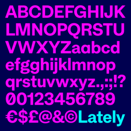
RT Lately is in many ways the result of an inquiry into snapshots of gothics’ evolution throughout time and space. It recalls the memories of naive designs and timeless classics alike by morphing them into a contemporary sans.
RT Lately now comes in 8 styles, 4 weights with corresponding italics and is exclusively available through RazziaType.
Check out other Razzia typefaces:
Credits
Typeface
Website
Animations
Designed by Mirco Schiavone, spacing and kerning by Igino Marini
Design, copy writing and documentation by Mirco Schiavone
Designed by Mirco Schiavone and animated by Fabian Luginbühl
RT Lately is a time-traveling witness to the evolution of gothics and attests to over a century of technological and stylistic transitions. By building on the past, it accentuates instances throughout the timeline and shifts its legacy back to the zeitgeist.
ORIGIN
Times Gothic
Times Gothic in “American Line Type Book: Borders and Ornaments Price List, Printing Machinery and Material”, American Type Founders Company, 1906, images provided by “The Letterform Archive”
Sometime in 2021 I was digitally flipping through an American Type Founders specimen when a typeface called Times Gothic caught my attention. It is based on Grotesque No. 4, originally cast by the Scottish type foundry “Miller & Richard” from Edinburgh.
Some minor differences aside, the two typefaces seem to be the exact same design. The wonkiness and raw nature of this sans somehow sparked my interest. It was presented on just a handful of pages with the stereotypical sample text in various sizes.
Times Gothic with generally wide proportions visible here the letters e, o but also n
Times Gothic’s probably most striking characteristic are its overall wide proportions and almost geometric construction rendering round glyphs very circular. The widths are further extended through the typeface’s narrow apertures and horizontal terminals both of which move stroke endings outwards. Other key glyphs like the n often adapt accordingly and are designed rather wide as well.
Times Gothic’s overall low contrast with higher contrast applied to middle strokes and crossbars for example in a, e and g
Times Gothic’s low contrast is generally better modulated in straight shapes than round ones. In letters with a higher stroke density due to multiple horizontals, higher contrast is applied to middle strokes and cross bars to keep outer strokes more monolinear.
Comparison of Times Gothic’s uppercase and lowercase key glyphs
Clogging shapes in Times Gothic’s letters A, G and N where strokes meet
Irregularities of stem thickness can be seen in the O, whose horizontal stroke is too thick to match its vertical stroke. Contrary to this geometric construction the strokes of the o are well balanced. The lowercase is generally more refined compared to the sometimes crude uppercase shapes, which often struggle with contrast and weight distribution.
At the same time Times Gothic’s rough aesthetic comes in large parts from the lack of visual corrections to compensate certain effects. One example would be the dark spots generated by two or more strokes meeting which leads to larger, darker spots, see A, N or G.
Franklin Gothic
Franklin Gothic in “American Line Type Book: Borders and Ornaments Price List, Printing Machinery and Material”, American Type Founders Company, 1906, images provided by “The Letterform Archive”
While strong in personality Times Gothic is naive in approach and raw in execution. It lacks the sensitivity of a widely applicable sans and was only in parts useful as a reference. For instances where it failed to deliver, another offered some guidance.
Just a few pages back within the same specimen, Franklin Gothic can be found. It was originally designed by Morris Fuller Benton and released in 1902 as a single style. Compared to Times Gothic it is in many ways a more nuanced and sophisticated design. Despite being over 120 years old it still looks very contemporary and is known for its outstanding performance in display settings.
Franklin Gothic’s characteristic join treatment in a, n and d
One of Franklin Gothic’s most notable features is its treatment of joins. Bowls, shoulders and arms of shapes like b, d, h, m, n, p, q, r, and u simply intersect the stems without any transition.
The strokes of letters with diagonals like A, M, and N in Franklin Gothic alternate in thickness
The oval counters of o, c and e
The second prominent feature is the typeface’s contrast. Vertical strokes are visibly thicker than horizontal strokes as can be seen in E, L and P. The strokes of letters with diagonals like A, M and N alternate in thickness creating a rhythmic pattern. Contrary to the monolinearity of Times Gothic this set-up helps to avoid the clogging up of shapes. In round shapes like e, o and c the contrast creates a nicely calibrated tension between oval counter and a more circular outline.
Both the joins and the contrast have an overall lightening effect and allow the proportions to stay narrow despite the bold weight. The interplay of these formal qualities lets the typeface excel in tight type setting while never appearing too crowded.
ITC Franklin Gothic
“Photoautomat” wordmark photographed on the way to my studio, Kanzleiareal Zürich
When I first developed an interest in typefaces as part of my design education, I would often try to identify the fonts I saw on the streets of Zurich. It was during that time I noticed the old photobooths. They had this backlit, white panel with bright red letters spelling “Photoautomat”. The analog application and the display quality of the shapes were striking. These glowing signs spread throughout the city were my first conscious encounter with Franklin Gothic, or so I thought.
Screenshot of the digitized ITC Franklin Gothic Demi
The “Photoautomat” wordmark is in fact set in ITC Franklin Gothic Demi which was released in 1980 along with the weights Book, Medium and Heavy. At the time the “International Typeface Corporation” (ITC) commissioned Victor Caruso to develop an extension of the original Franklin Gothic for photo typesetting.
Whenever typefaces made these transitions into new technologies they were altered in the process. A certain degree of change is inevitable but in this case some of the key features were redesigned with quite an effect. While ITC’s version is branded as a new Franklin Gothic it departs in many ways from the original.
Franklin Gothic’s lower x-height (left) compared to ITC Franklin Gothic’s higher x-height (right)
Raising the x-height was a common practice ITC used in their adaptations for photo typesetting. Nevertheless it’s a significant intervention since a higher x-height affects a wide variety of glyphs. It was by far not unique to this ITC redesign but here it contributed to a wider range of changes all pointing in one direction.
Franklin Gothic’s intersecting joins (top) compared to ITC Franklin Gothic’s smoother transitions (bottom)
Franklin Gothic’s personality defining joins were the subject of further impactful changes. Morris Fuller Benton’s original attaches strokes to stems without any curves applied. Caruso’s redesign fully smoothes these stroke connections in letters like m and n to a fluent transition from stem to shoulder and to a lesser degree in letters with bowls such as the d.
Franklin Gothic’s clearly angled terminals (top) compared to ITC Franklin Gothic’s terminals approaching the horizontal (bottom)
Franklin Gothic on top with a narrower a and wider r compared to ITC Franklin Gothic on the bottom with a wider a and a narrower r
ITC Franklin Gothic’s angles in terminals have been reduced to closely approach the horizontal. See a, c and e for reference. Even Franklin Gothic’s distinguishing asymmetric c has been replaced with a version where top and bottom terminals closely mirror each other.
Alongside these broader interventions, glyph specific modifications were made as well. Key letters were changed in width and style altering the overall proportions. Notable examples include the narrower r and the wider a.
To conclude, nobody can say for sure what the motivation behind the aforementioned changes was. What’s undeniable though is that raising the x-height, smoothing the joins, flattening the angle of the terminals and adjusting of glyphs goes beyond an update for better performance in photo type setting and pushes the typeface significantly closer to its hugely popular Swiss counterpart Helvetica.
DESIGN
I’m generally not too interested in historically accurate revivals in my work. Still, I’m convinced that a good understanding and formal analysis of the typefaces that came before is an advantage for designing new ones. RT Lately is a loose interpretation of the described influences paired with my personal taste and intuitive design decisions. References like the specimens I described are useful to discover potential for future projects and merely form a starting point. From a certain stage I usually open up my process allowing the typeface to decide what works best for it.
Vertical Proportions
Times Gothic (in the back) compared to RT Lately (in the front)
Times Gothic’s d kicked off RT Lately’s design as it contains the foundation for many personality defining characteristics. Some of Times Gothic’s letters are crudely designed but the d shows a higher level of quality in various aspects. Its vertical metrics, the degree of geometry, the treatment of joins and the overall contrast of the glyph strongly influenced the development of RT Lately.
Vertical metrics
RT Lately’s vertical metrics nicely interact with the geometry of the design while the modest x-height leaves enough room for the ascenders to extend giving the typeface a graceful presence.
Horizontal Proportions
Round letters leaning towards geometric proportions
RT Lately’s proportions are designed generously wide by carefully reinterpreting brutal geometry into softer and warmer shapes. The challenge was to deliver a strong personality while at the same time guaranteeing the quality and functionality of each letter’s drawing.
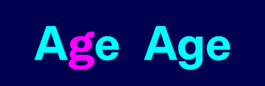
Default a (top) and alternate a.ss01 (bottom)
Default g (top) and alternate g.ss02 (bottom)
Default a + g (top) and with alternates a.ss01 + g.ss02 (bottom)
If desired, RT Lately’s geometric appearance can be further emphasized by activating one or both alternates through the typeface’s open type features. The stylistic set ss01 activates the single storey a while stylistic set ss02 activates the single storey g. Especially the alternate a is rather associated with traditional geometric typefaces and when both alternates are activated they are able to change RT Lately’s style significantly.
Contrast
Comparison of the o’s outline and its counter
Although I didn’t directly borrow too much from Franklin Gothic’s shapes, I adopted the idea of how inner and outer shapes interact. The o’s outline in RT Lately’s Bold weight is closely geometric and almost as tall as it is wide while its counter is of oval shape and creates a vibrant tension against it. This way RT Lately maintains a geometric appearance but avoids a rigid constructed aesthetic.

Contrast visualized through a mathematically constructed circle with the thickness of the vertical stroke of the o
The relationship between outline and counter automatically creates a degree of contrast. Once the optimal level was found for each weight it was applied to every glyph. It ensures even color in text blocks and thus makes RT Lately a versatile tool for various tasks.
Uppercase and lowercase contrast
Uppercase letters usually feature slightly thicker stems than the lowercase to compensate for additional white space due to their larger dimensions. The delicate balance was often exagerated in early grotesques and lead to peculiar results.
As a nod to these naive approaches RT Lately’s uppercase is designed slightly heavier than perfect and with slightly less contrast compared to the lowercase. Imperfections like these, employed carefully, can be used to award typefaces a nuanced personality.
Joins
Join treatment of shoulders, arms and bowls
I continued the tension of inner and outer shapes beyond just the round letters. The joins of shoulders in n, m and h are smoother and rounder on the inside but grow out of the stem in a seemingly straighter manner on the outside.
Same goes for the joins of bowls which are carefully tapered to optically retain the bowls’ effortless roundness, avoid clogging in small sizes and lend the typeface its clean and crisp look.
A special case is the r which features a more abrupt transition. In small sizes the arm almost seems to intersect the stem unmitigated. In larger sizes the true drawing with its smoother transition becomes visible.
Terminals & Apertures
Horizontally cut terminals and narrow apertures
Apertures of G and a
Apertures of S and e
RT Lately’s terminals are horizontally cut. The typeface manages to keep its apertures narrow enough to preserve a geometric vibe throughout the family while ensuring optimal balance in colour inside and out.
Italics
Italics
RT Lately’s italic features a modest 10° angle. The glyphs were continuously proofed, adjusted and received the same care as their upright counterpart. Their drawing is sharp and precise to optically match the upright style and seamlessly integrate in text.
Dots, Accents & Punctuation
Square punctuation and accents
RT Lately’s dots, punctuation and accents are square and represent a nice counterpart to the typeface’s circular shapes. they are designed in sufficient size to be well readable and form a integrated part of the characterset.
Open Type Features
Default a - alternate a.ss01
Default g - alternate g.ss02
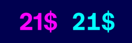
Zero - slashed zero
Default figures & currency - Tabular
Fractions
Default figures - circled ss03 - circled and inverted ss04
RT Lately is in many ways the result of an inquiry into snapshots of gothics’ evolution throughout time and space. It recalls the memories of naive designs and timeless classics alike by morphing them into a contemporary sans.
RT Lately now comes in 8 styles, 4 weights with corresponding italics and is exclusively available through RazziaType.
Check out other Razzia typefaces:
Credits
Typeface
Designed by Mirco Schiavone, spacing and kerning by Igino Marini
Website
Design, copy writing and documentation by Mirco Schiavone
Animations
Designed by Mirco Schiavone and animated by Fabian Luginbühl